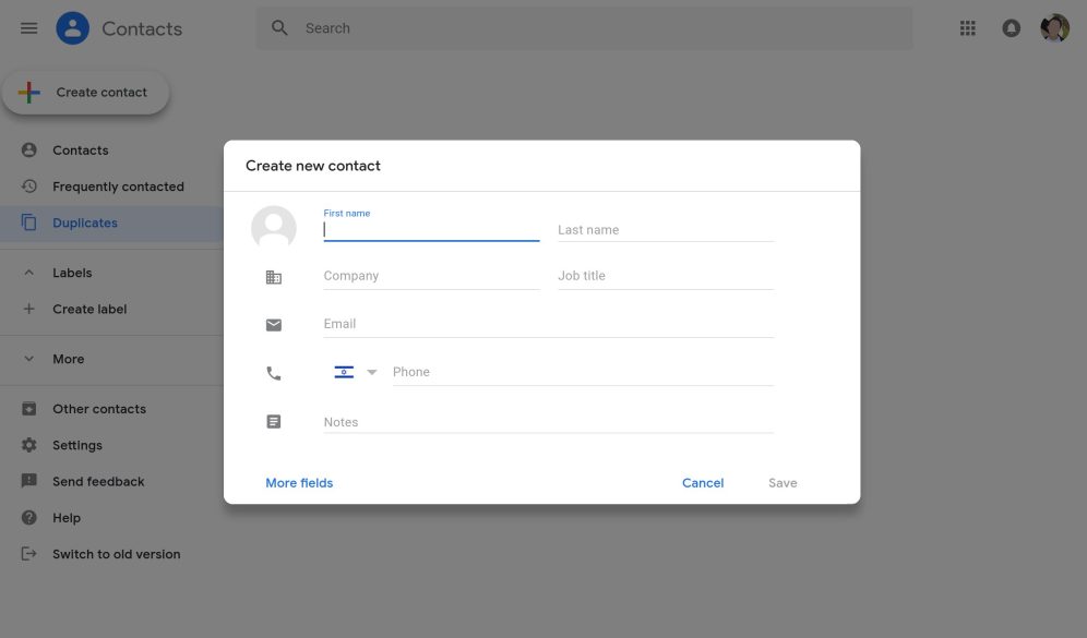
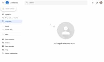
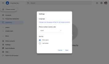
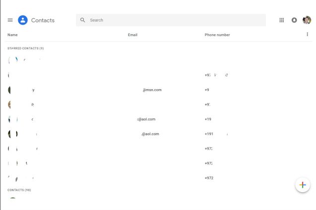
As the old Google Contacts interface nears its end, Google pushed out an update that brings the Material Theme to Google Contacts’ web interface. The new design makes the interface more uniform in that it now looks like it’s Android and Gmail companions.
Other apps and services in Google’s catalog have also made the move to the Material design. For example, Google’s Hotel Search, Google Docs, and Google Discover. Hence, it’s no surprise that the company wants to bring the same design to Contacts.
The new change is already available for a few users and focuses more on the cosmetic appeal of the interface. The “Create Contact” button is now in the sidebar just like in Gmail. It’s a subtle change but the differences are there.


