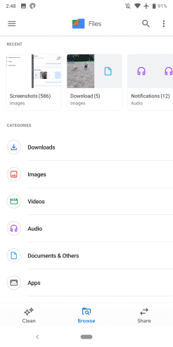
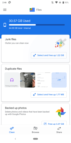
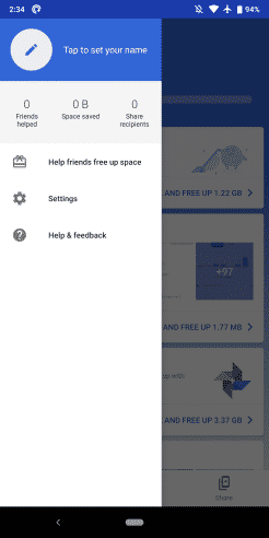
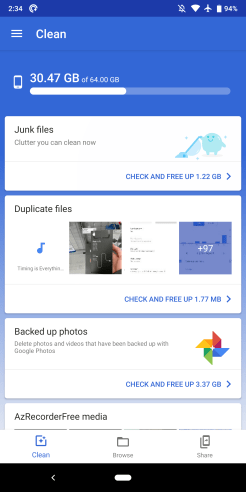
As Google pushes its Material Theme design to more apps and services, “Files”, the re-branded Files Go app gets a new look with an update. The new design sees the app merging with the status bar for a more refined interface.
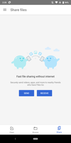
The navigation drawer remains. From there, you can still access settings, share, and savings status. However, the bottom bar now features new Material design icons.
Strange enough, the cards that show Junk or Duplicate files have yet to update with a Material look. Yet, the buttons inside the cards have been updated to the new style.
Update 11/8: Google finally announces the name change, noting that the app has an international audience and 30 million active users per month. The new name is now officially “Files by Google.”
In less than a year, Files Go has grown tremendously to serve over 30 million monthly users. We’ve noticed that people across the globe are using it, no matter what type of mobile phone they have or how fast their internet connection is. We often find that products designed for the Next Billion Users work just as well for everyone—including people with a fast 4G connection and a top of the line smartphone who want to organize their files and save on storage as well!
Google
Other sections of the “Files” app like the Browser tab now feature colorful buttons. The buttons for Downloads, Images, and Videos all show off the new Material design.
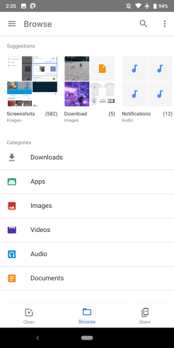
Version 1.0.219550556 of Files is rolling out via the Play Store. However, for now, the Google Material Theme might require joining the app’s beta program. See the old Files Go interface below.
Other apps and services that recently received the Material Theme update include Google Search For Hotel, Google Docs, Google Contacts, and Google Discover.
